Create Design System Variables and Styles Fast
A faster way to start design systems. Use Kigen to create your core variables and styles in just a few clicks.
A modern design system for crafting elegant, consistent, and scalable user interfaces for mobile and web.
Our Amazing Features

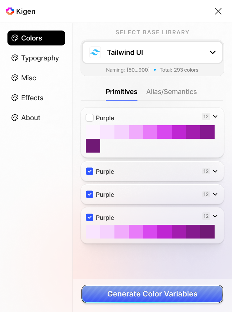
Color Palette
A collection of primitive color palettes sourced from popular design systems like Material, Fluent, Tailwind, Polaris, and more — ready to use and extend for your brand.
Predefined Variables
Start fast with a ready-to-use variable set built on best practices — easily customizable, so you never have to worry about how to begin.
Semantic/Alias
A ready-to-use set of semantics and aliases mapped to colors for Success, Error, Warning, and more — designed for accessible and consistent UI communication.
Typography
Tokenized font sizes, weights, and line heights ensure scalable and consistent text styling across your product.
Size & Misc Variables
Standardized spacing scale and size variables for padding, margins, and layout dimensions—fully bind with variables.
Documentation
Export all in JSON, CSS and more, also print all necessary token details for review, sharing, or developer handoff as documentation.
Frequently asked questions
Any question about Kigen?
If you have any questions or need support, feel free to get in touch.

